Welcome to
Vilnius TechFusion
digital brand book.

Vilnius’ business ecosystem has a new name – TechFusion. It has many definitions. It’s a close-knit community that connects the most advanced technology sectors and a unique environment where new talents emerge daily. It’s the city itself – comfortable, future-driven, and open-minded. Here 2 + 2 = 5. Always. 

Vilnius TechFusion brand identity reflects an always-changing, moving, and growing city, which is not afraid to experiment and stand out.

Logo

This is Vilnius TechFusion logo. It represents the brand both ideologically and visually. The logo symbolizes movement in the Vilnius business and innovation community. The top and bottom symbols are there to represent the letter V (as in Vilnius city). City’s movement, changeability is expressed through the changing and fusing letter V. The whole movement is framed in a circle, which stands for territory – Vilnius.

This logo is the central element of the brand. Its distinctive shape sets the tone for the brand’s graphic elements and tone. This is the only version of the logo.

Clear space

To make sure that our logo has good readability, we firstly must assure the clears pace around it. The logo must be surrounded by a clear space that must be free from other elements (e.g. imagery, text). The space also serves as a minimum distance from the edge of any given format.

The height of the logo defines the h value, which is the main measurement. Based on it, we can establish minimum clear space around the logo, which needs to be no less than 1/2 h.

Scalability

It must be assured that the logo is readable in any circumstances, so we must make sure that the logo’s minimum size in print and digital media is correct.

Digital media

The minimum size in digital media must be 130 px.

Print

The minimum size in printed media must be 45 mm.

Color options

There are 4 logo color options that you can use.

Red & black version

This color combination is the main Vilnius TechFusion version. We use this version on white backgrounds.F

Red & white version

This color combination can be used on black backgrounds.

Negative version
This version should be used on dark-colored or black backgrounds.
Positive version

This version should be used on lighter color backgrounds. 

Vilnius TechFusion x Vilnius logo

Horizontal composition

This is an example of how Vilnius TechFusion and  Vilnius logos should be composed. h stands for Vilnius TechFusion logo symbol. When putting together these logos, Vilnius logo height should be equal to h

Depending on how much space we have, space between logos can vary, but it is important to keep clear space between logos.

Vertical composition

This is an example of how Vilnius TechFusion and Vilnius logos should be composed vertically. This proportion uses the same rules as in horizontal composition. 

Space between logos can vary, but it is important to keep clear space between logos.

Vilnius TechFusion x Go Vilnius

Horizontal composition

This is an example of how Vilnius TechFusion and Go Vilnius logos should be composed. h symbolizes the height of Vilnius TechFusion wordmark and Go Vilnius castle symbol. 

Depending on how much space we have, space between logos can vary. However, it is important to keep clear space between logos.

Vertical composition

This is an example of how Vilnius TechFusion and Go Vilnius logos should be composed vertically. This proportion uses the same rules as in horizontal composition. 

Space between logos can vary, but it is important to keep clear space between logos.

Vilnius TechFusion x Wolficorn

Proportion

When used together with Vilnius TechFusion logo, Wolficorn height should be 1,5 h (h stands for Vilnius TechFusion logo height).

Composition

These are examples of logo and Wolficorn should be composed. We use Wolficorn and VIlnius TechFusion logo in separate corners of our visual. They should be aligned within centers. We place Wolficorn on the left, and logo on the right.

Incorrect use of logo

Do not stretch logo unproportionally.

Do not change proportions between symbol and name.

Do not rotate logo.

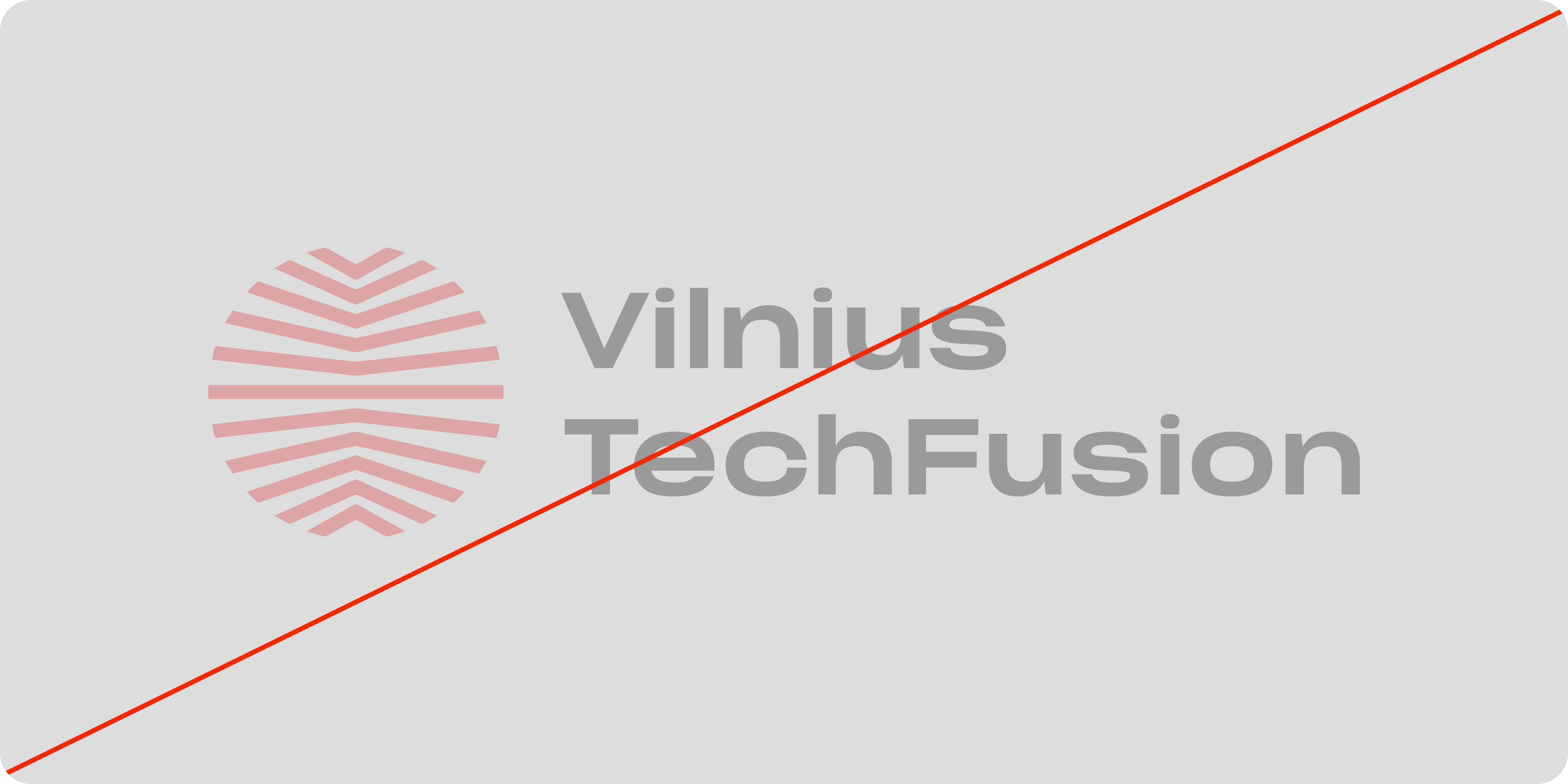
Do not use transparent logo.​

Do not change colors of symbol nor name.

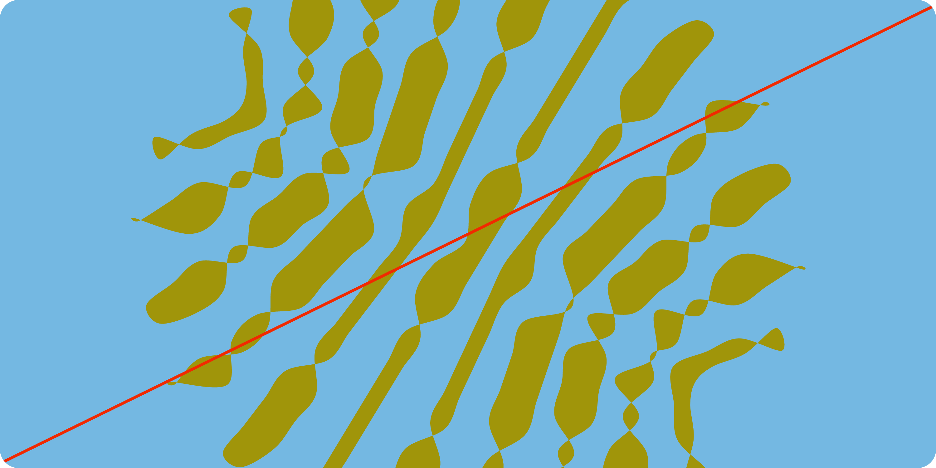
Do not use logo on busy graphic elements, where it becomes hard to see logo.

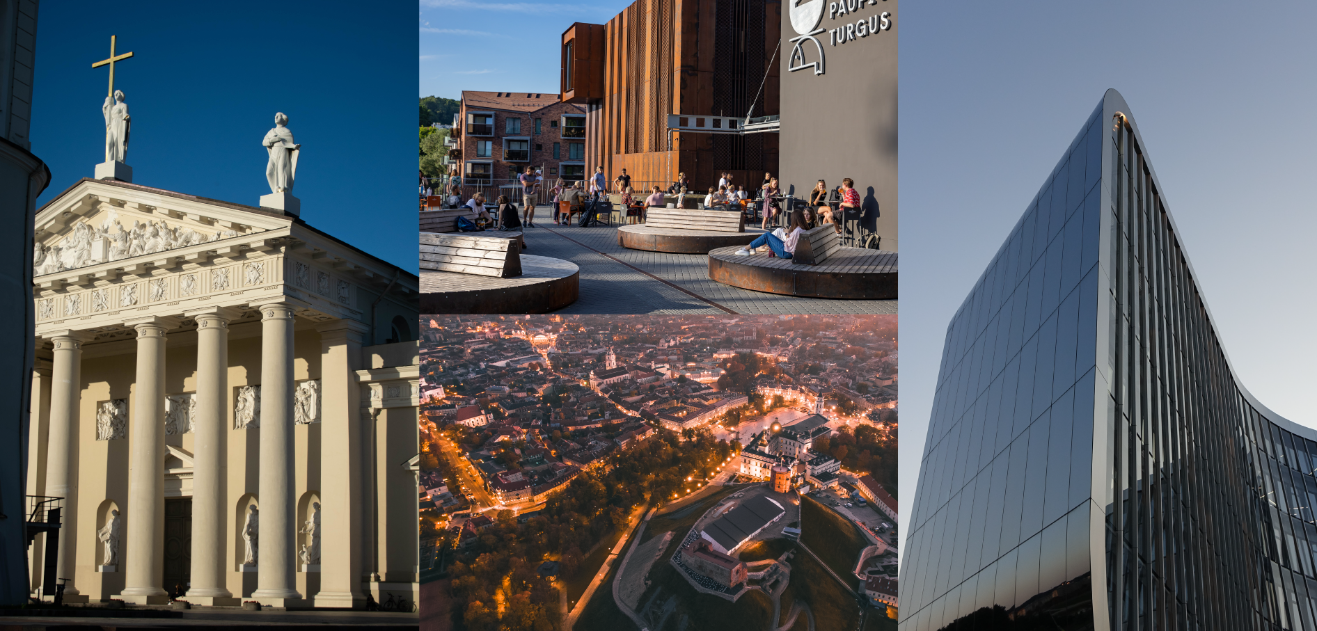
Do not use logo on busy photographs, where it becomes hard to see logo.

Brand colors

Main colors

There are 4 main colors of Vilnius TechFusion.

HEX: DC2323
RGB: 220, 35, 35
CMYK: 5, 95, 90, 0
Pantone 485 C

HEX: EDEEE3
RGB: 237, 238, 227
CMYK: 9, 4, 13, 0
Pantone 7534 C

HEX: 000000 
RGB: 0, 0, 0
CMYK: 0, 0, 0, 100
PANTONE Black C 

HEX: FFFFFF 
RGB: 255, 255, 255
CMYK: 0, 0, 0, 0
PANTONE White

Secondary colors

In order to make our brand brighter and more contrasting, we use secondary colors

HEX: FF8FDE
RGB: 255, 143, 222
CMYK: 10, 50, 0, 0
PANTONE 2037 C

HEX: B542EA
RGB: 181, 66, 234
CMYK: 59, 76, 0, 0
PANTONE 2582 C

HEX: 004A7C
RGB: 0, 74, 124
CMYK: 98, 70, 26, 11
PANTONE 2384 C

HEX: 0074EC
RGB: 0, 116, 236
CMYK: 82, 54, 0, 0
PANTONE 2174 C

HEX: 74B8E2
RGB: 116, 184, 226
CMYK: 56, 13, 0, 0
PANTONE 2142 C

HEX: FF9A63
RGB: 255, 154, 99
CMYK: 0, 50, 61, 0
PANTONE 2023 C

HEX: A0950A
RGB: 160, 146, 10
CMYK: 39, 29, 100, 13
PANTONE 398 C

HEX: 8C8377
RGB: 140, 131, 119
CMYK: 042, 38, 45, 21
PANTONE Warm Grey 8 C

Shades of red

In some cases, there might be a need for darker or lighter versions of red.

HEX: F45555
RGB: 244, 85, 85
CMYK: 0, 84, 55, 0
PANTONE 2346 C

HEX: 9A291F
RGB: 154, 41, 31
CMYK: 23, 100, 95, 18
PANTONE 7628 C

Typography

To make our brand unique and rememberable, we are fusing 2 types of typography. For the headlines, we are using serif type Value Serif and for the text block, we are using sans serif font Surt.

Headlines and sub-headlines

For the headlines, use Value Serif Regular
For the sub-headlines, use Surt Normal Light.

Highlights and numbers

For text that needs to be highlighted, use Surt Normal Bold.
For numbers, we use DM Mono.

Example

This is an example of how to use typography.

Graphic element

The graphic element is the most important part of Vilnius TechFusion visual language. It must be used in most of our communication. The graphic element is created from the logo, using the generative tool. It is always different, always evolving and moving.

Colors of graphic element

To make the graphic element more interesting, we always use two color combos – one for background and the other for graphic element. There are 3 different color combos we can use. 

Main color combo

These combos are created with black & white, TechFusion Red color + another color. Avoid using it underneath text blocks.

Monochromatic combos

These are monochromatic color combos. These combos are recommended to use underneath text blocks.

Contrasting combos

These are color combinations made from contrasting colors. Avoid using it underneath text blocks.

Graphic element and type

These are examples of how Monochromatic Color combos can be composed with type. Overlaying text and graphic element can be used.

Graphic element and images

One way to use graphic element with imagery, is to separate into two blocks. Preferably, we use Monochromatic Color combo for graphic element. 

Another way is to use it imagery, is to put it underneath the central character of the picture. For this, you will need to crop the main character and put the element in the layer underneath. 

This composition should be used with minimal background pictures. Do not use it on busy backgrounds.

What to avoid

Do not rotate it.

Do not stretch it.

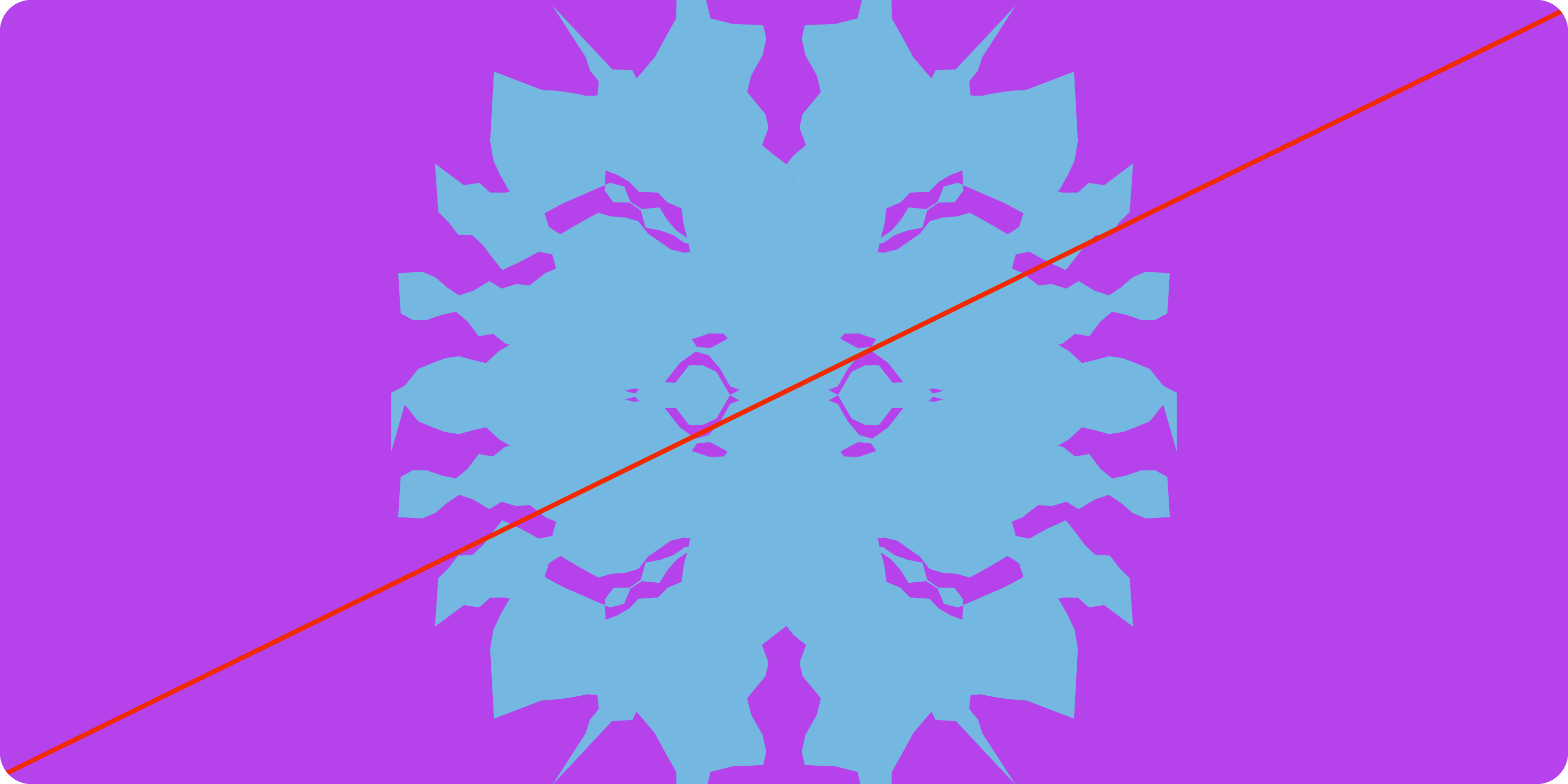
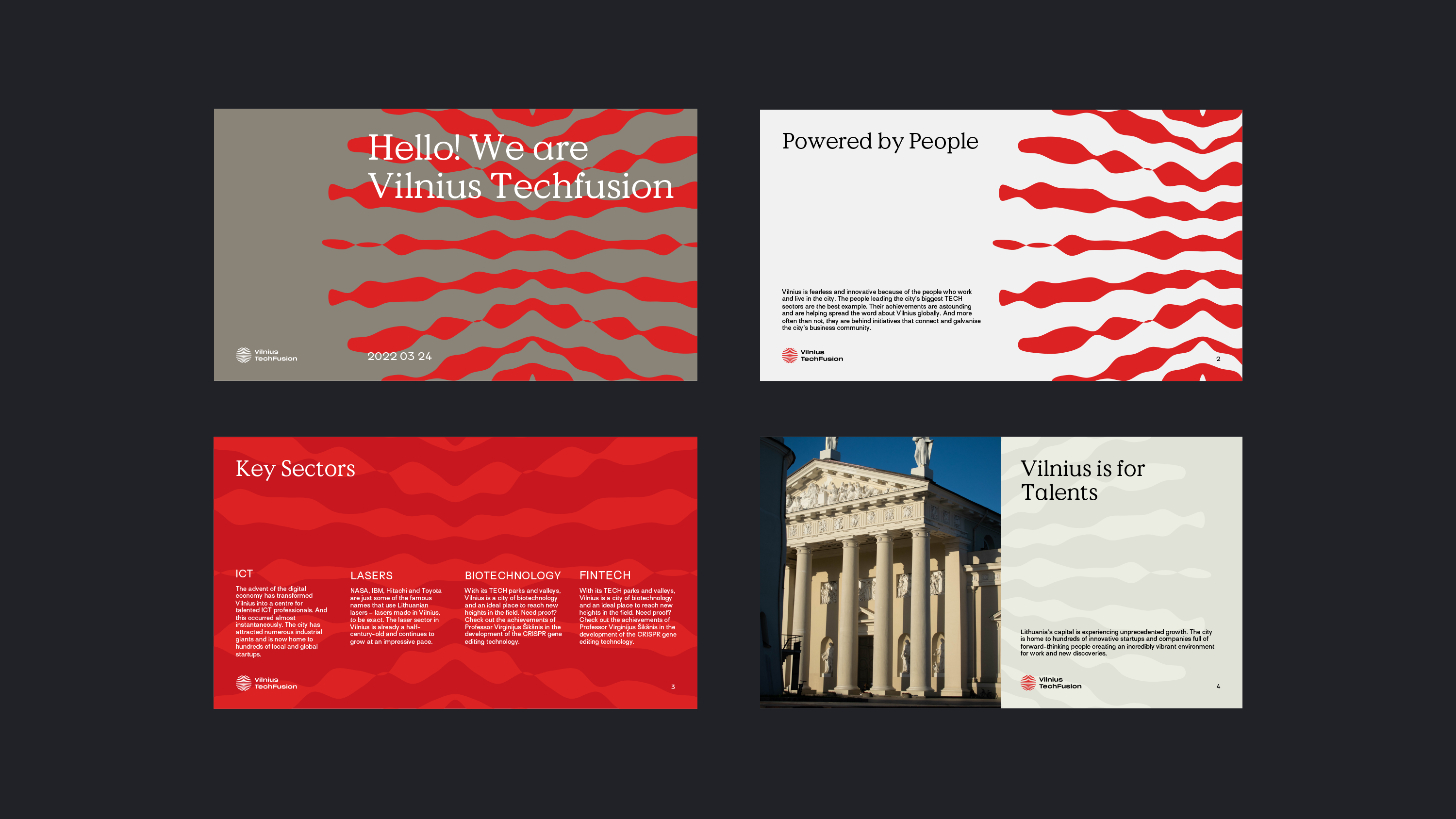
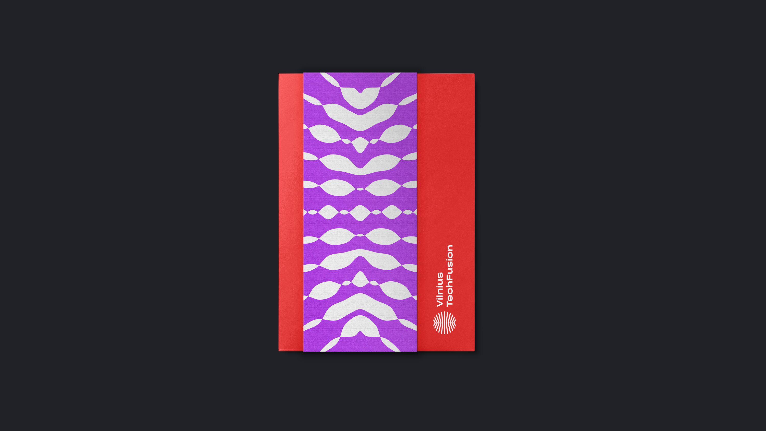
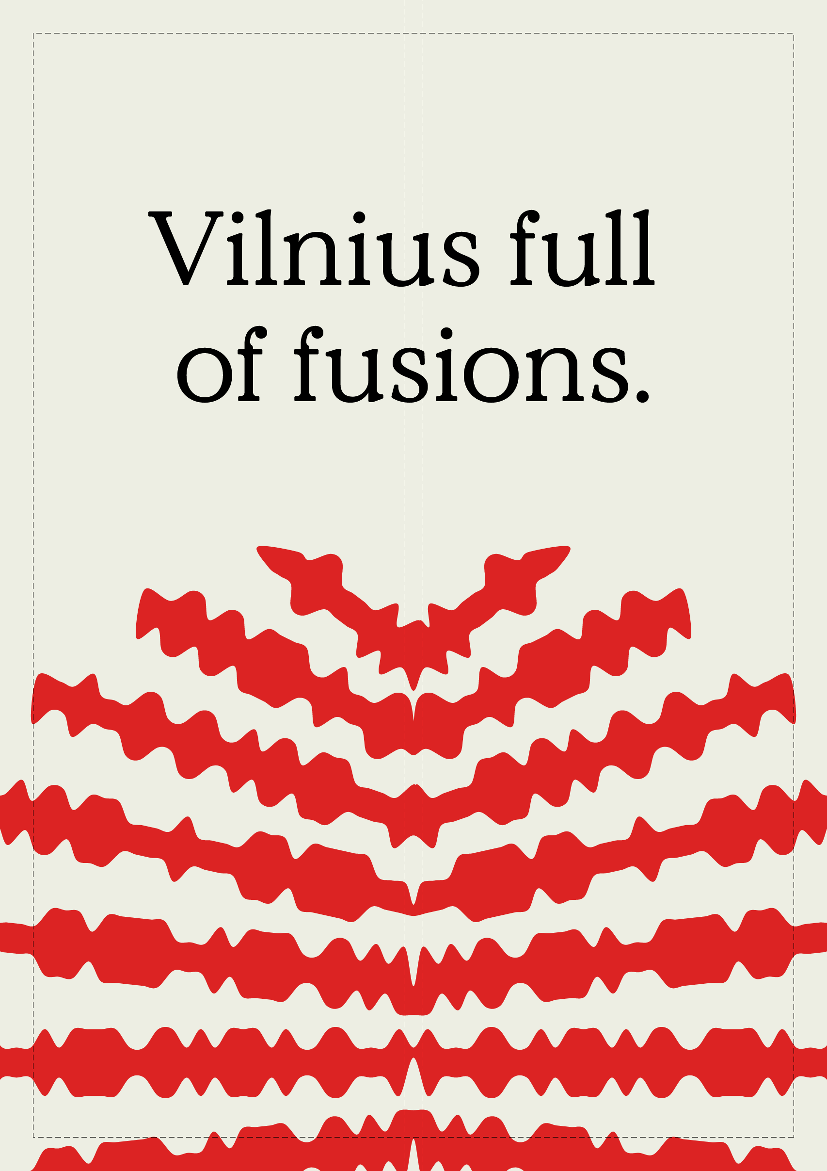
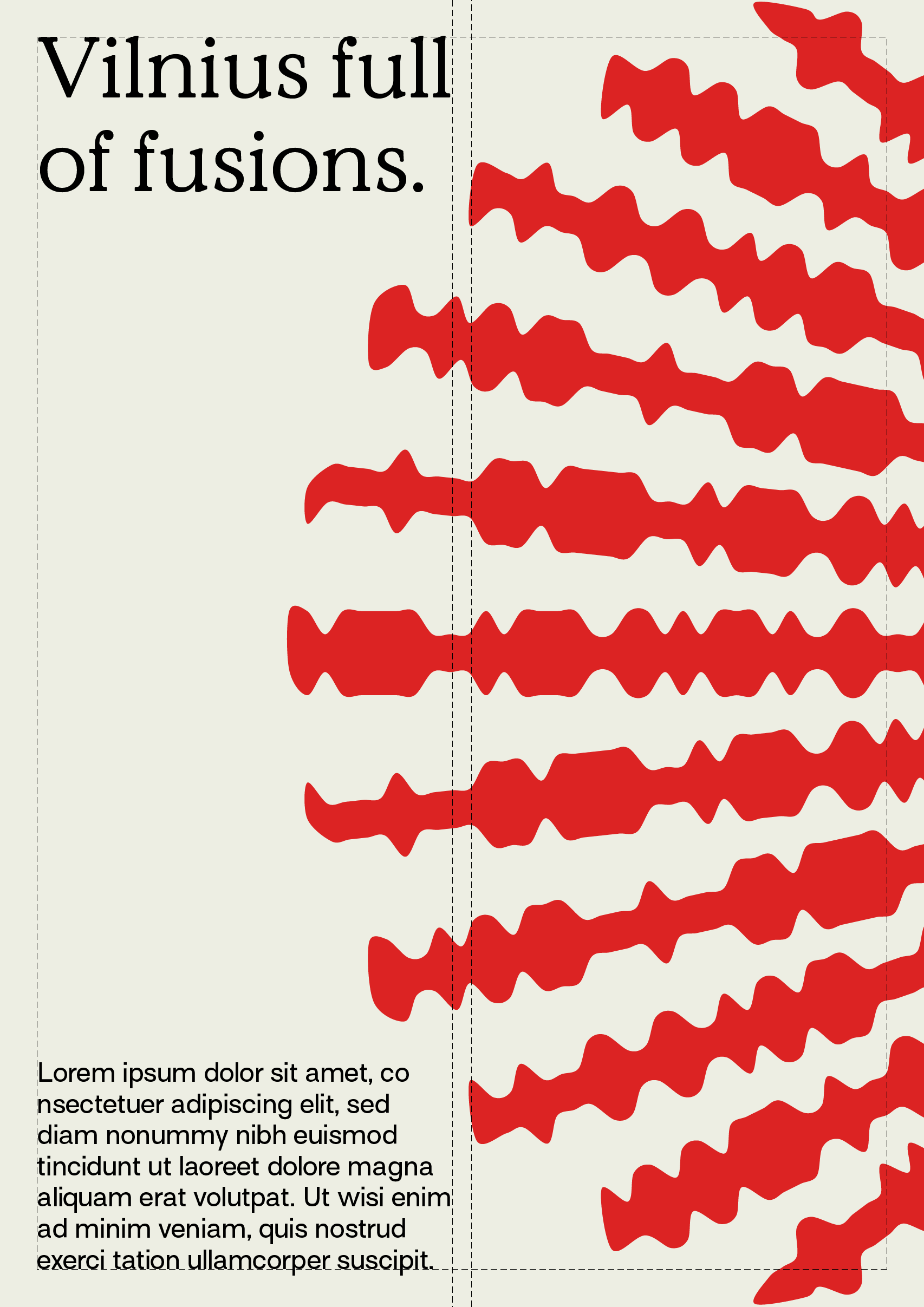
Do not use extreme variations of the graphic element. There must be a clear relation between logo and graphic element.

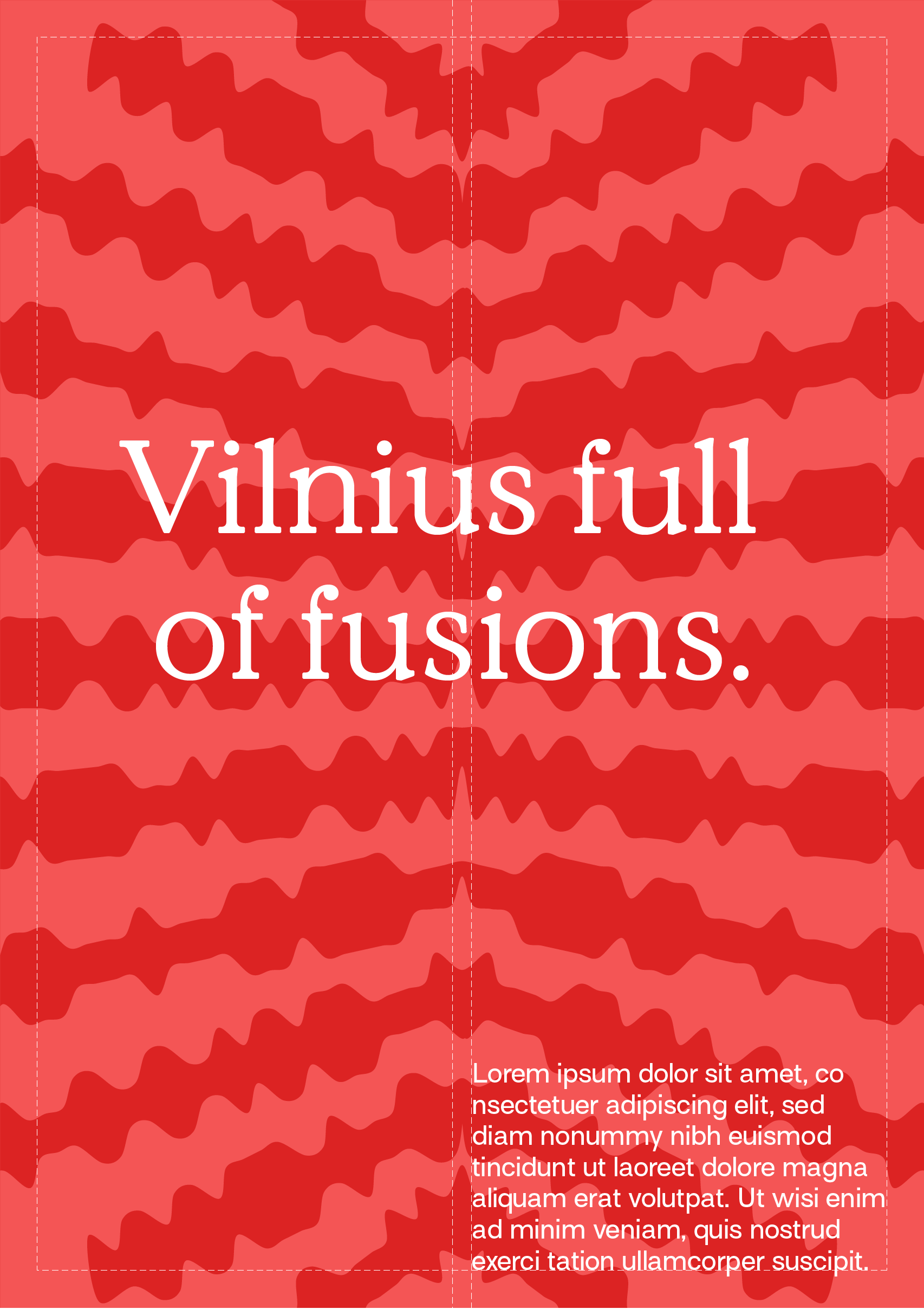
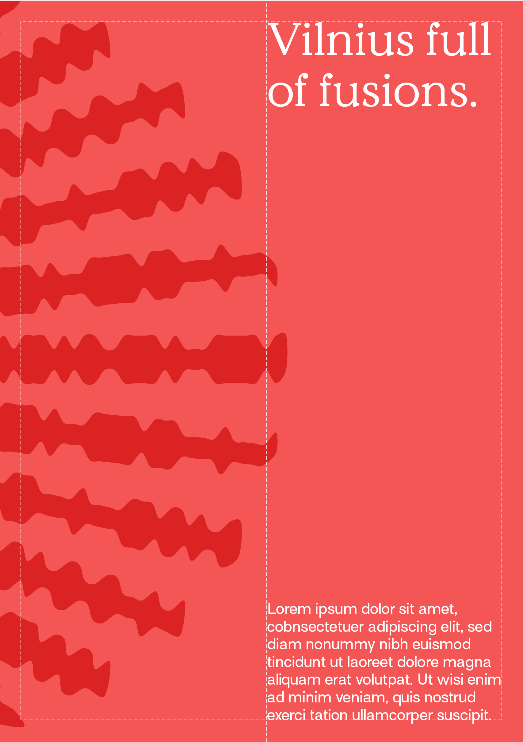
Do not use it with busy backgrounds.

Do not use extremely Contrasting Color combinations overlayed with text.

Layouts

Digital & print adaptation for different formats and other formats of similar proportions. Below are some examples of the different placement options.

Layouts in prints

Size of space of graphic elements in vertical formats equals to one third of layout height, i.e. 1/3 of layout height.

Size of space of graphic elements in horizontal formats equals to one half of layout length, i.e. 1/2 of layout length.

Layouts in digital

Graphic elements & photos can be placed in a one third or one half layout size. Below are some examples of the different placement options.

These are examples of using only graphic elements in promotional communication layouts.

These are examples how use photo & graphic elements combination in promotional communication layouts.

Imagery

Pictures are also an important part of the Vilnius TechFusion brand. In order to have continuous brand imagery, here you will find guides on how to use imagery within the brand.

Images of people

People’s poses, facial expressions should be natural. They should be in natural surroundings. Instead of artificial, we should use natural daylighting.

Images of Vilnius

For images of Vilnius, we should use the ones with natural colors, deeper tones, and interesting compositions. Do not use imagery with a grey sky.

What to avoid

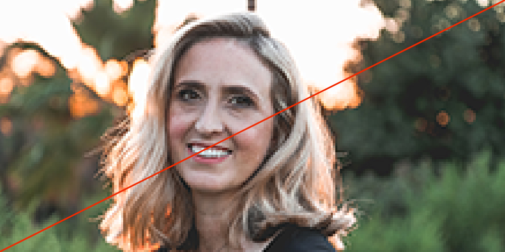
Do not use images with low resolution.

Do not use images with filters.

Do not use images with complicated composition.

Do not use images where people pose unnaturally.

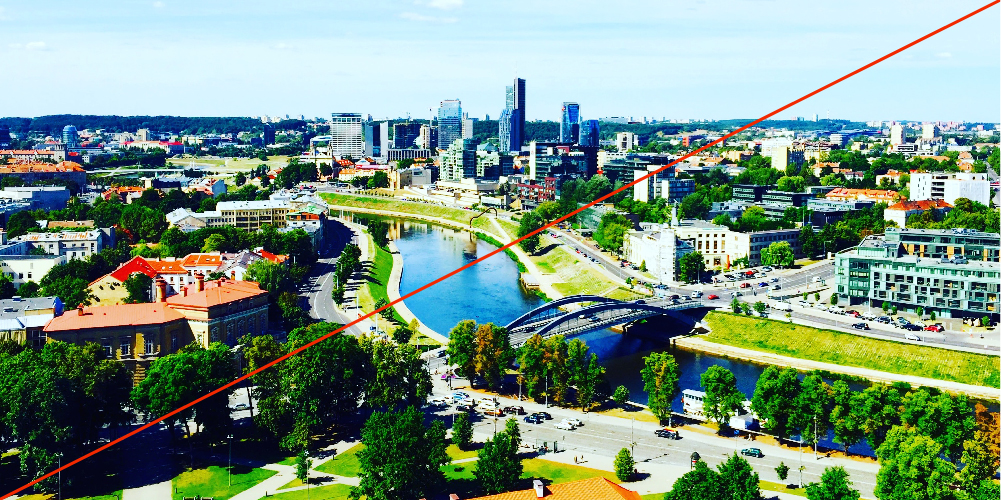
Do not use images that are over-edited.

Do not use images with drastic effects.

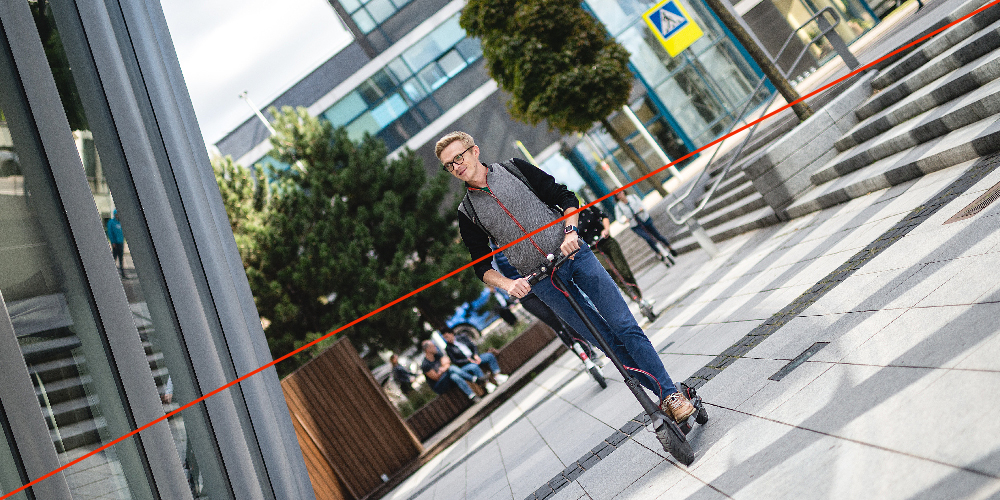
Do not use images with uncomfortable rotations.

Illustration style

These are Vilnius TechFusion illustrations. They are inspired by dynamic logo elements, that are used in the drawing of an object. Additionally, we add swooshes and arrows. The whole illustration must be colored with one color, for instance, in the examples below we have black illustrations on colorful background.

Illustrations

Design in use

Here you will find examples of Vilnius TechFusion design used in stationary, digital mediums, and attributes.

Digital

Video screensaver (10 s)

Video call background

Stationary

Folder

Envelope

Certificate of appreciation

Attributes

Business card

Broshure

Print Media Design Example (A4)

Sweatshirt

Tote bag

Pin

Outdoor

Media wall 3000×2000 mm

Roll up

Horizontal flag

Vertical flag

Congrats! You have read Vilnius TechFusion brand book.

This visual identity was
designed and developed by
Sons & Daughters ID.

www.sonsdaughtersid.com